How simple text boosts ESM / EMA data interpretation for mental health practitioners.
TL;DR
An m-Path study shows that adding simple textual descriptions to experience sampling (ESM) / ecological momentary assessment (EMA) graphs helps mental health practitioners interpret data more accurately and confidently, unlocking the full potential of personalized feedback in therapy.
Imagine being able to see exactly how your client’s symptoms, mood, and activities fluctuate from morning to night, day after day, in their real-world context.
That’s what experience sampling methodology (ESM) / ecological momentary assessment (EMA) offers. By prompting people multiple times a day on their phone, ESM / EMA captures the fine-grained patterns of their emotions, behaviors, and contexts.
This isn’t just data for data’s sake. When visualized well, ESM / EMA feedback can guide case conceptualization, spark new therapeutic insights, and track progress over time. It can also help clients recognize their own patterns and make them feel more empowered to change them.
But there’s a catch: Most ESM / EMA dashboards are built for researchers, not for frontline therapists. And if the graphs are confusing or misleading, they can lead to poor clinical decisions.
The challenge: Complex data meets clinical decisions
Even for trained psychologists, interpreting statistics and uncertainty is hard. Error bars, confidence intervals… they’re often more familiar to researchers than to clinicians.
Yet when therapists look at an ESM / EMA dashboard, they have to decide:
- Are these patterns meaningful or just noise?
- Can I act on this insight now, or should I gather more data first?
Misinterpreting uncertainty can lead to premature interventions or missed opportunities.
Our experiment at a glance
Because it's m-Path's mission to unlock the potential of ESM / EMA for clinical practice, our research team designed an experiment with 40 mental health practitioners and clinical master’s students.
We created 4 realistic clinical mock cases (e.g., an elderly person seeking treatment to cope with feelings of loneliness), and each case came with interactive ESM visualizations from the m-Path platform. We systematically varied 3 features:
- Hover tooltips revealing extra (e.g., contextual) information 🖱
- Error bars showing 95% confidence intervals 📊
- Short textual descriptions about effect sizes and confidence 💬
We then tested how well participants interpreted the data, how confident they felt, and what kind of treatment decisions they made based on the feedback.
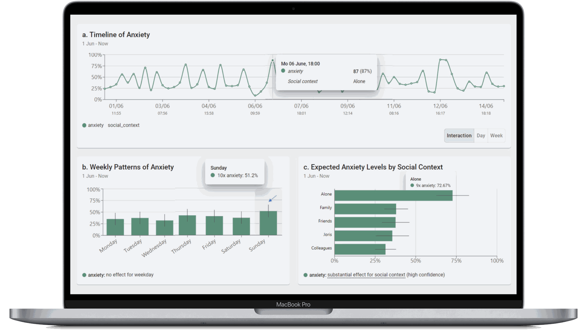
Screenshot of (mock) ESM / EMA feedback in the clinical m-Path dashboard.
The results: Words beat error bars
Participants who saw textual descriptions about effect size and confidence were:
- More confident in their interpretations
- More accurate in judging whether effects were real or not
- More likely to propose concrete next treatment steps
In contrast, error bars and hover functionalities didn’t help at all. Practitioners didn’t become more accurate or confident when error bars or the hover function were present, suggesting that these common research-style, UI visuals may not translate well to clinical settings.
In short: a single sentence explaining the data worked better than statistical visuals.
How confidence shapes clinical decisions
We also looked at how practitioners’ confidence influenced their treatment decisions:
- When they felt less confident 🤔, they leaned toward further exploration: gathering more data, running patient interviews, or talking with the patient’s network.
- When they felt confident 😏, they were more likely to propose action-oriented interventions like behavioral exercises or involving family members.
This shows that uncertainty doesn’t just affect interpretation, it drives the clinical path forward. Getting the level of confidence right matters.
Why this matters for your practice
If you’re using or considering ESM / EMA in therapy (or you want to provide clinicians with an intuitive ESM / EMA dashboard yourself 😅), here’s what this study means for you:
- Don’t assume visuals speak for themselves. Even simple-looking graphs can be misread without context.
- Support your visuals with clear text. A short description (e.g., “Anxiety was consistently higher on social days with 95% confidence”) can massively boost comprehension.
- Tailor complexity to your audience. Practitioners may prefer intuitive summaries, while researchers can handle raw statistical details.
Ultimately, ESM feedback should be designed to guide decisions, not just to display data.
A personal take-home message
There’s growing momentum around ESM / EMA tools in mental health care. But to fully unlock their potential, we need to design dashboards with clinicians in mind, not just data scientists.
Textual explanations of uncertainty are a simple, powerful step forward, and with this insight m-Path is again one step closer to empowering practitioners to turn complex data into clear therapeutic action.
Check out our dedicated manual page on how to use our (simplified) clinical dashboard.
👉 Explore the full paper here: Internet Interventions, 2025.